DIFF!
Fries are great, but let’s be real — it’s the seasoning that steals the show. That’s where DIFF! comes in. Bold, unapologetic flavor that takes your fries from ‘meh’ to ‘mouth party.’ Because if you’re not doing it for the fries, what are you even doing? DO IT FOR THE FRIES!
MEET DIFF!
A brand that crackles with flavor—its logo takes three bold forms, each packed with the punchy energy of a French fry at full crunch.

FULL FLAVOR LOCKUP

ICON LOGO

WORDMARK


A modern sans serif that's as bold as our flavors and as versatile as the mighty French fry.
This typeface brings clarity with character—clean lines, confident weight, and just enough attitude to turn heads. Whether it's leading a headline or tagging a sauce packet, it keeps DIFF looking fresh, loud, and easy to digest at every scale.

We went full throttle with bold primaries—because DIFF doesn’t whisper, it shouts

ADDITIONAL VISUAL ELEMENTS
Bold blobs, cheeky shapes, and a whole lotta attitude—these visual misfits bring the DIFF chaos full circle.


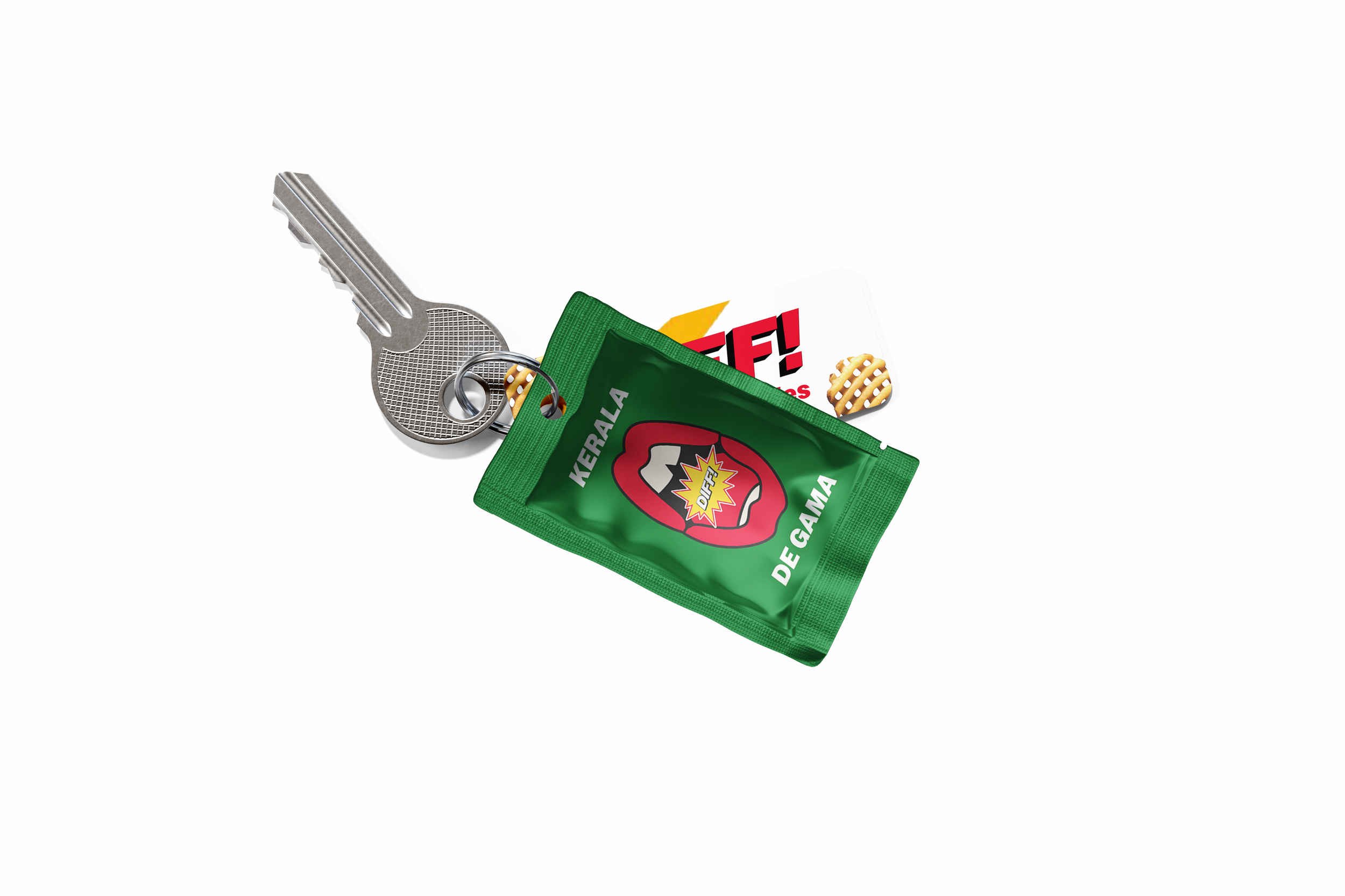
MEET THE STARS:
Kansas City Jazz, Seoul Umami, and Karala De Gama

Smoky, sweet, and smooth like a Sunday sax solo—with a surprise hit of mango that riffs at the end.
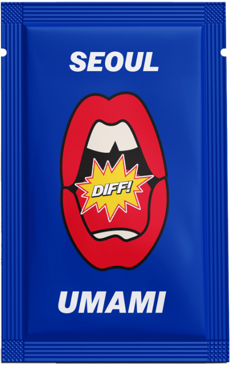
The savory standout. Gochujang, sesame, and a kiss of MSG come together in perfect flavor fusion.

Aromatic and bold. Chili brings the heat, coconut cools it down. Spice harmony at its finest.
DIFF! HITS THE STREETS
Posters, billboards, and a whole lotta flavor—this is how we season the world, one wall at a time.

Free samples at the bottom—just tear, taste, and try not to fall in love.

DIFF TAKES THE HIGHWAY:
DIFF! took over 100 miles of the country’s most boring highway and turned it into a giant game of hangman—because road trips deserve a little spice (and a lot less silence).


DISCARD PILE:
A, U, B, Z, Y, Q

GOODIES
The only seasoning with a merch line.

CW: Adam Fuller
CBM: Erin Kang
AD: Nico Morris
AD: Ethan Stamper
STRAT: Agrim Prakash